Jay wasn't sure on the name – "Mohawk Community Builders is a possibility," he wrote, and emphasized, "It would need to highlight the skilled trades component." He explained that the logo would be used for community and college fundraisers, for the nonprofit open house after the renos, and for sponsorship packages, media relations and a website.
"This is a project that combines Mohawk's renovation program and our events planning program," concluded Jay. "It's about doing a reno and building community capacity."
Our students love to be challenged and this seemed like another great opportunity to do what we as graphic designers do best: visual problem solving that effectively and dynamically meets the needs of our clients, promotes their products and services and reinforces their mission statements and philosophy. We showed some rough concepts sketches and got an enthusiastic response -- now here's a look at the finished logo designs some of our 4th semester Creative Studio students came up with:
Designer: Vy Pham
Designer: Tom Aceti

Designer: Courtney Pascoe
Designer: Shea Easterbrook

Designer: Amber Matheson
Designer: Nick Sterling
Designer: Christie Hoeksema

Designer: Samille Elliston
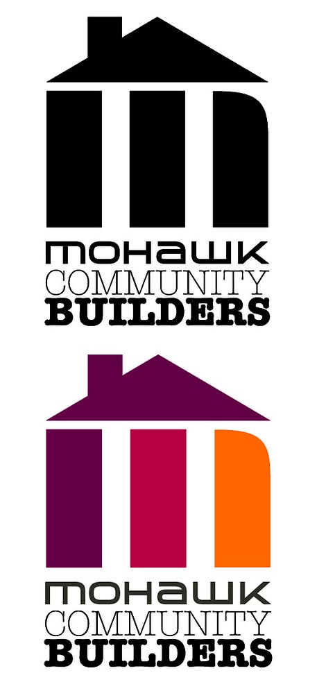
Designer: Ange Blomberg

Designer: Sophia Palermo
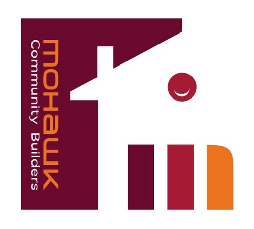
Designer: Tom Pepper
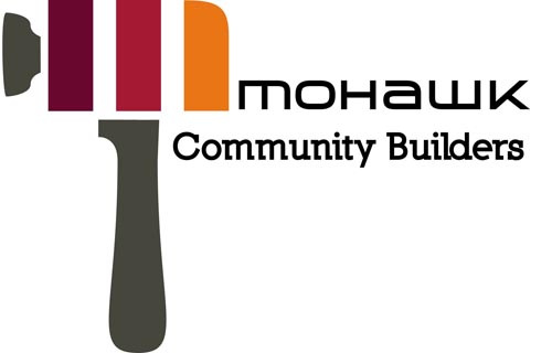
The students also designed posters that could serve a variety of promotional purposes for the Mohawk Community Builders initiative.

Keep scrolling down to see each of these designs in a larger format.

No comments:
Post a Comment